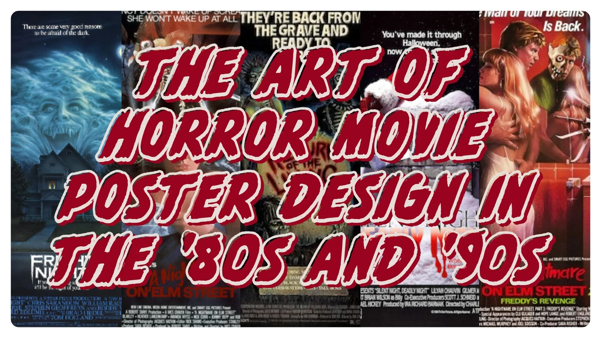
Before streaming thumbnails and endless scrolling, horror lived and died by its posters. One image — bold, painterly, unapologetically lurid — could stalk your imagination from the theater lobby to the video store aisle. These weren’t just ads. They were invitations to danger.
Further reading: Physical Media Is Memory You Can Hold · The Role of Nostalgia in Horror Fandom · Start a Horror Memorabilia Collection on a Budget
Painterly Mythmaking: The ’80s
In the 1980s, illustration reigned. Artists like Drew Struzan and Enzo Sciotti didn’t sell plots — they sold myth. A single composition could carry a film’s entire temperature: Freddy’s blades tearing the night, Jason’s silhouette carved from moonlight, logotypes that felt like warnings. You didn’t need the movie to feel the movie.
Related reading: Physical Media Is Memory You Can Hold
Lobbies, Aisles, and the Ritual of Choosing
Theaters and video stores were galleries of menace. One-sheets glowed behind glass; clamshells and sleeves echoed the same promises. You studied brushstrokes, type, and negative space like clues. Selection was ritual — a slow draw toward the title that owned your pulse. The poster did the first kill; the film finished the job.
Artifacts With Scars
For collectors, posters outgrew marketing. Fold lines, tack holes, sun-fade, theater stamps — every scar became provenance. Hanging one wasn’t décor; it was declaration. Like a VHS spine, a poster is a fixed point in your personal timeline — the night you first pressed play, the friend who swore they “weren’t scared,” the sleep you didn’t get.
The ’90s Shift: Photographic Precision
By the ’90s, horror’s face changed — literally. Out went paint; in came cool photography, glassy gradients, tight typography. Think Scream’s wide-eyed close-up or the iconic ensemble “floating heads” that lined mall multiplexes. Less painterly, more commercial — but no less formative. Those images framed a generation’s coming-of-age in widescreen anxiety.
Two Eras, One Pulse
Today’s collectors chase both: painted ’80s one-sheets and glossy ’90s studio campaigns. One leans mythic, the other clinical; both preserve a specific feeling of being chosen by a movie before the credits rolled. That heartbeat — memory made physical — is the same energy driving the broader physical-media rebellion.
Related reading: The Role of Nostalgia in Horror Fandom
Posters vs. Thumbnails
Posters world-build; thumbnails sort. A poster gives you scale, texture, tone — a prelude you can live with on a wall. A thumbnail gives you a square. In an ecosystem engineered for speed, owning the original art (folded or rolled, scars intact) is an act of resistance against cultural decay. It says horror deserves more than a 300-pixel pitch.
Why It Matters
Horror’s posters make the genre legible at a glance — the mask, the blade, the scream, the font that looks like it might cut you. They’re not souvenirs; they’re a visual canon. Preserving them keeps the lineage unbroken: the myths of the ’80s, the cool menace of the ’90s, and the way both still shape what we fear now.
Wrapping Up
If a single poster still lives in your head — name it, and tell me why. Then, if your walls are bare, start with one piece that defined you. Hang it. Let it change the room.
Explore next: Physical Media Is Memory You Can Hold · Start a Horror Memorabilia Collection on a Budget
Leave a Reply