Modern Horror Merchandising is Broken
New Line Cinema’s latest A Nightmare on Elm Street 4K collection perfectly encapsulates everything frustrating about contemporary horror merchandising. It’s a release that simultaneously respects and disrespects its source material, creating a bizarre split personality that reveals how disconnected studios have become from their core audience.
The Good News First
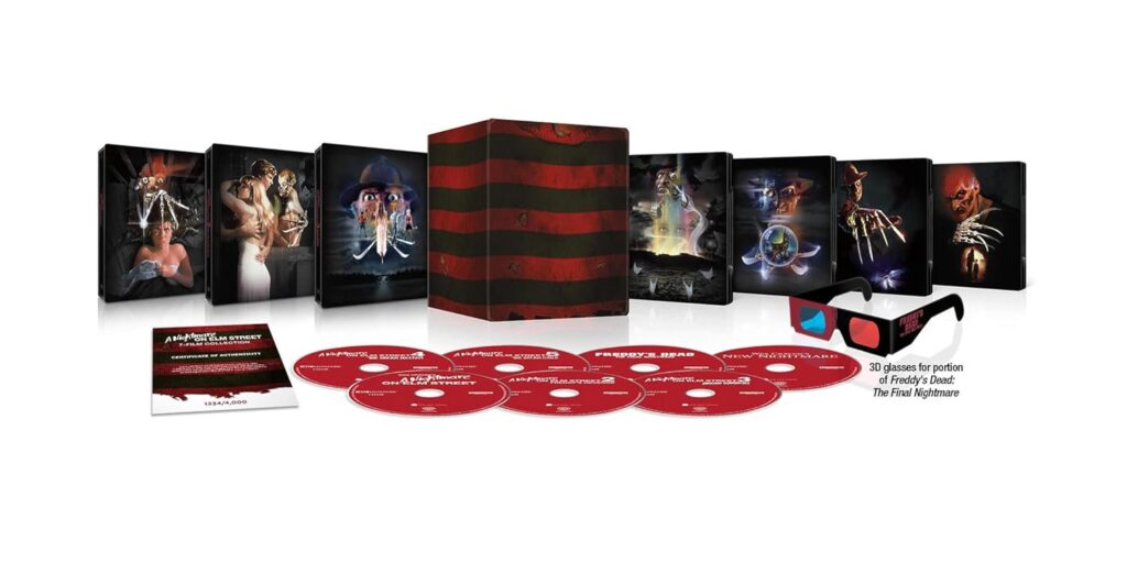
The steelbook designs themselves are a masterclass in fan service done right. By featuring the original theatrical poster artwork, New Line demonstrates they understand what collectors actually want—authentic representations of these films’ theatrical heritage. These posters aren’t mere marketing materials; they’re pieces of horror history that shaped how millions first encountered Freddy Krueger. Seeing them properly showcased on premium packaging feels like validation for decades of fan requests.
Where Everything Falls Apart
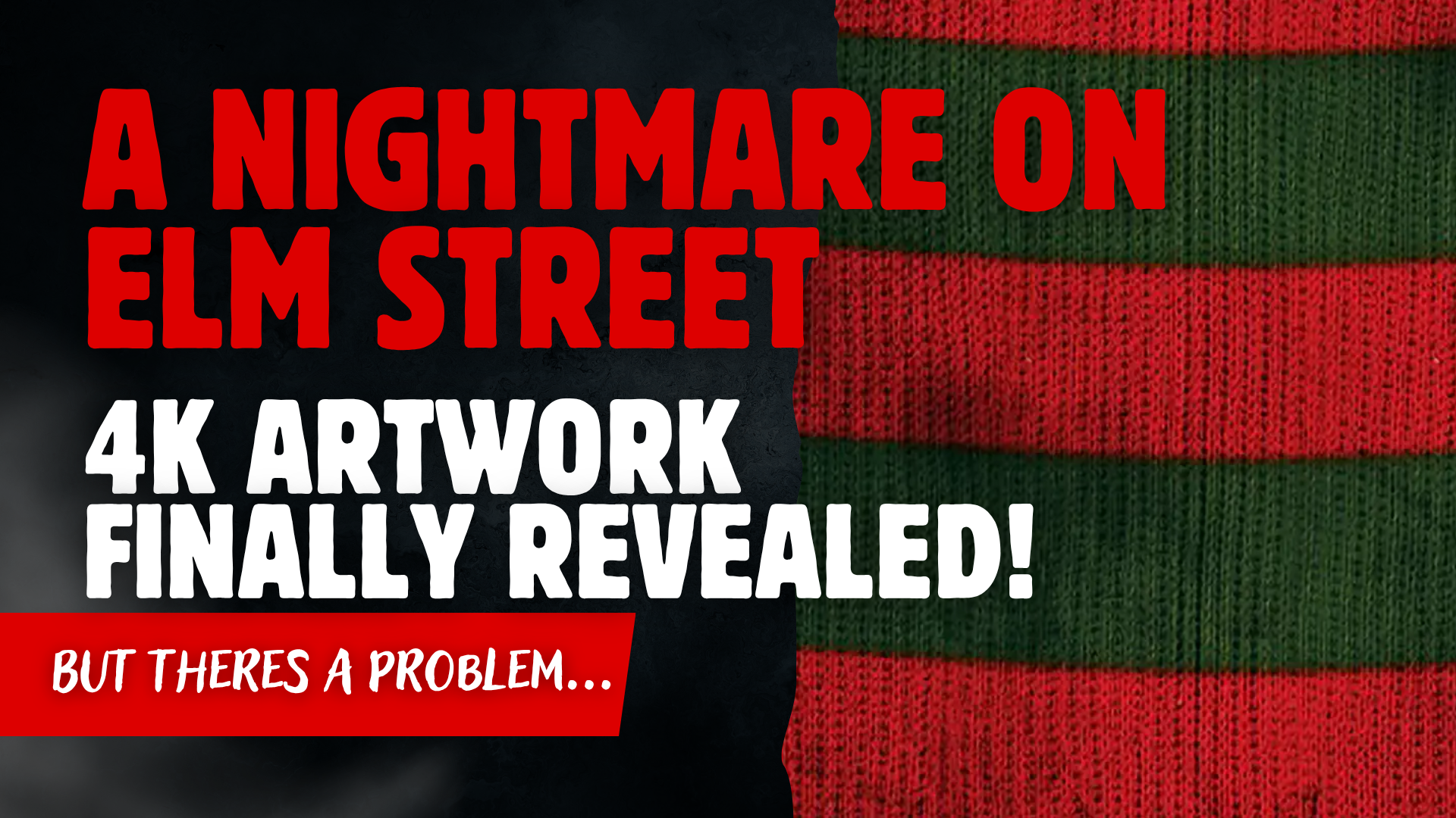
Then you encounter the outer box, and the illusion shatters completely. Someone at New Line apparently decided that Freddy’s sweater pattern represents peak design sophistication—a choice that reveals a fundamental misunderstanding of what makes this franchise visually compelling.
The sweater stripe approach isn’t just aesthetically weak; it’s creatively bankrupt. We’re dealing with a series renowned for boundary-pushing visual effects, surreal production design, and innovative cinematography. These films transformed everyday suburban environments into psychological battlegrounds and pioneered dream logic as narrative structure. Reducing all that visual innovation to a clothing pattern feels almost insulting to the artists who created these iconic images.
Worse still, this design philosophy has failed repeatedly across multiple product lines. From t-shirts to phone cases to previous home video releases, the red-and-green stripe motif consistently produces merchandise that looks cheap and uninspired. It’s become the Nightmare equivalent of slapping a band logo on a black shirt and calling it design.
Format Choices That Miss the Point
The standard edition’s presentation philosophy proves equally problematic. Stacking multiple films into one oversized case treats the Nightmare series like a television season rather than a collection of distinct cinematic experiences. Each entry in this franchise represents a different creative team’s interpretation of the Elm Street mythology, from Wes Craven’s raw suburban paranoia to Chuck Russell’s comic book sensibilities to Renny Harlin’s MTV-influenced spectacle.
When you package them as undifferentiated content, you’re erasing those individual creative voices in favor of brand efficiency. It’s particularly galling when combined with recycled cover art that’s remained unchanged since the Reagan administration. If you’re asking fans to repurchase content they already own, shouldn’t there be some acknowledgment that visual presentation has evolved over the past four decades?
The Bigger Picture
This release highlights a concerning trend in how major studios approach horror fandom. There’s an underlying assumption that genre enthusiasts are easy marks—passionate enough to buy anything, but not sophisticated enough to demand quality presentation. This couldn’t be further from reality. Horror collectors are among the most knowledgeable and demanding consumers in entertainment, with encyclopedic knowledge of different releases and sharp eyes for production value.
Look at how boutique labels like Vinegar Syndrome or Grindhouse Releasing approach their horror catalog. These companies understand that presentation is part of the experience, that packaging design should enhance rather than diminish the films it contains. They create artwork that captures atmosphere and tone, that makes you excited to revisit familiar content or discover something new.
What Success Looks Like
Contrast New Line’s approach with recent releases from companies that take horror seriously. Criterion’s Mulholland Drive edition uses abstract imagery that reflects Lynch’s fractured reality. Arrow Video’s horror collections feature commissioned artwork that reinterprets classic films through contemporary artistic lenses. These releases understand that great packaging should function as an extension of the films themselves, not just a delivery mechanism.
The difference comes down to intention versus convenience. When studios invest creative energy in presentation, they signal that these films matter as art, not just product. When they default to the most obvious visual shorthand available, they communicate that efficiency trumps artistry.
The Real Tragedy
What makes this particularly frustrating is how close New Line came to getting it right. The steelbooks prove they have access to talented designers who understand the franchise’s visual legacy. The 4K restorations demonstrate technical commitment to preserving these films for future generations. All the pieces existed for a genuinely special release that would satisfy both hardcore collectors and newcomers discovering these films.
Instead, we got a product that feels half-hearted—beautiful individual components undermined by packaging choices that suggest indifference rather than celebration. It’s emblematic of an industry that’s forgotten how to properly honor its genre heritage, treating horror properties as content to be efficiently distributed rather than art to be carefully curated.
The horror community has supported these franchises through decades of diminishing returns and questionable creative decisions. We’ve earned merchandising that matches our passion and knowledge. Until studios recognize that presentation matters as much as preservation, we’ll continue getting releases that feel more like missed opportunities than genuine celebrations of the films we love.
You can order the Amazon Exclusive Box Set here if/when it comes back in stock – https://amzn.to/3GSAJqc (Amazon Affiliate link)
Support the Crypt
If you’re into physical media, horror nostalgia, and media that still breathes, you’ll want to be in The Crypt — my free newsletter for collectors, fans, and the horror-minded.
Related Posts
- The 2010 Nightmare on Elm Street: Real Monsters in Plain Sight
- The Devil’s Rejects — The Outlaw Sequel That Makes You Mourn Maniacs
- How to Start Your Own Horror Memorabilia Collection on a Budget
- The Nostalgia Factor: How Collecting Connects Us to the Past
- The Value of Physical Media in the Streaming Era
Leave a Reply